A Viral Headline, Penmanship, and the Colbert Show: A Logo Story
Did we change our logo because Gen Z can’t read cursive? Well, yes and no.
Last spring we held several forums and presentations to share our new, updated logo. The sessions included reasons for pursuing a new brand and the process involved in arriving at the new mark. Earlier this semester we announced the new logo on our website.
In mid-October, WTOP, a Washington, D.C., news radio station and website, published a story based on our announcement of the new logo. The headline read, “‘It's too hard to read': Washington College leaves cursive logo behind.”

The opening portion of the headline being in quotes would lead anyone to believe that this is what the College said—when it is not. That WTOP story got picked up as a talking point for network morning radio shows and focused on K-12 schools no longer teaching cursive writing in a somewhat derisive manner.
Of course, those radio shows were given talking points that were likely based only on the WTOP headline and not the article they published. In it, WTOP correctly quoted our announcement as saying, “Because cursive writing is no longer taught universally in K-12 education, the script—especially this highly stylized version—was difficult to read and not immediately recognizable for many prospective students.”
Brands large and small, some with historic legacies, have been moving away from using cursive and script in their logos and branding for some time now. Last year, Eddie Bauer shed their 59-year-old script logo, commenting in an article on Fast Company that one of the reasons for the change was “kids don't even learn to read cursive in school anymore.”

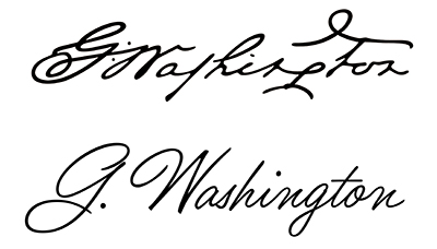
The lack of teaching cursive was, for us, an important but secondary issue. The 18th-century script of Washington's signature was the primary impediment to legibility because it features letterforms that bear no resemblance to modern scripts. The legibility issue of the signature was covered in a number of articles and online posts including Yahoo! Life and a Baltimore Banner story stating, “… the ‘W' in his signature looks kind of like an ‘M' or an ‘N.' The ‘S' looks maybe a bit like an ‘L'? And the ‘T' looks like an ‘F.' So who can blame the school for updating their logo, when it could be read as ‘D Nalhingfon' instead of ‘G. Washington'?”
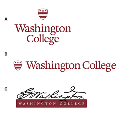
By all accounts, the signature logo was chosen in 2013, in part, because of its representation of the College's history. As we explored options to replace the script, we looked for other visuals from our past that would retain and respect the College's historical importance and our unique ties to the nation's first president. The Washington crest/shield became that visual. While the signature has only been in use by the College since 2013, the shield has been a part of the Washington College seal as far back as our visual records cover. That made the shield an even more powerful symbol of the institution's history and provides deeper ties to our founder. The signature for which many alumni have a fondness remains in use throughout our current branding as a graphic element in our overall visual identity to create more dynamic designs, often using it as a watermark. But as a primary logo, it simply does not work.


As an institution of higher learning focused on attracting and retaining a growing class of students in the years to come, it was paramount that our image and brand become more recognizable, especially in the digital space. As we expanded into digital marketing, the old logo was difficult to read. Last fall we ran several online display and social media ads. One of them did not mention Washington College in the ad text, instead it only contained the signature logo in the lower corner of the ad. It was not performing well so we changed the copy to include the College's name, and it took off. There are a lot of reasons for the improved performance, but one of them is that viewers could now identify who the ad was representing.
Monday, October 28 at 10:59 p.m. That's when The Late Show with Stephen Colbert ran its “Meanwhile” segment featuring news stories that included THC infused baked goods, Helen Mirren, and yes, Washington College. Colbert's joke, “Washington College is leaving its cursive logo behind because it's too hard to read.” The graphics in the segment were taken directly from the WTOP headline. He continued “Damn! If only there was some sort of institution of learning that could help people understand … words.” (By the way, Washington features one of the best writing across the curriculum programs you can find.)
All in all, a decent joke. Still, we heard from many alumni who were upset over their perceived disparaging of our college. The reality is that how the media picks up stories (especially an entertainment show looking for comedy) and how they choose to present them is not something we can control, nor often know it is happening until something is on the air.

Here is what you need to know—the change in the logo is not frivolous. How a new design is received is subjective, and we understand that. Through all of this, our goal has been to increase applications and enrollment by implementing new recruitment and marketing strategies, and the logo change is part of that overarching plan. The good news? It's working. Last year our applications saw a 41% increase from a 5-year high mark of 2,855 in 2020 to 4,035 last year. This year we are already up 37% in applications from 885 last year as of October 29 to 1,212 this year.
The College is working to make the transition to the new logo as sustainable as possible. We are not recycling all materials en masse as may have once been the practice. Instead, we are allowing them to be replaced as new materials are needed over the coming year. To date, there have been no additional costs associated with the new logo, but we are exploring updates to campus signage and banners to be handled within our normal budget. We have already updated all publications produced in the last six months, the website, and other materials. Likewise, branded merchandise is being produced now and will be incorporated into our campus and online retail spaces.
— Brian Speer